Exploração e Visualização
Um pouco de matplotlib.
Resultados Esperados
- Junto com a aula passada, ferramentas simples para exploração de dados
- Aprender a base de Matplotlib para realizar um plot simples
- Aprender conceitos básicos de visualização dados
- Um pouco mais de filtro e seleção de dados
Sumário
- Introdução
- Análise Exploratória de Dados
- matplotlib
- Movies Dataset
- Base de actors
- Problemas de escala
- Dados 2d com e leitura de JSON
#In:
import matplotlib.pyplot as plt
import numpy as np
import pandas as pd
Código de Configurar Plot (Oculto)
```python #In: plt.rcParams['figure.figsize'] = (16, 10) plt.rcParams['axes.axisbelow'] = True plt.rcParams['axes.grid'] = True plt.rcParams['axes.labelsize'] = 16 plt.rcParams['axes.linewidth'] = 2 plt.rcParams['axes.spines.bottom'] = True plt.rcParams['axes.spines.left'] = True plt.rcParams['axes.titlesize'] = 16 plt.rcParams['axes.ymargin'] = 0.1 plt.rcParams['font.family'] = 'serif' plt.rcParams['grid.color'] = 'lightgrey' plt.rcParams['grid.linewidth'] = .1 plt.rcParams['xtick.bottom'] = True plt.rcParams['xtick.direction'] = 'out' plt.rcParams['xtick.labelsize'] = 16 plt.rcParams['xtick.major.size'] = 12 plt.rcParams['xtick.major.width'] = 1 plt.rcParams['xtick.minor.size'] = 6 plt.rcParams['xtick.minor.width'] = 1 plt.rcParams['xtick.minor.visible'] = True plt.rcParams['ytick.direction'] = 'out' plt.rcParams['ytick.labelsize'] = 16 plt.rcParams['ytick.left'] = True plt.rcParams['ytick.major.size'] = 12 plt.rcParams['ytick.major.width'] = 1 plt.rcParams['ytick.minor.size'] = 6 plt.rcParams['ytick.minor.width'] = 1 plt.rcParams['ytick.minor.visible'] = True plt.rcParams['legend.fontsize'] = 16 plt.rcParams['lines.linewidth'] = 4 plt.rcParams['lines.markersize'] = 80 ``` ```python #In: plt.style.use('tableau-colorblind10') plt.ion(); ```Introdução
Uma parte fundamental do kit de ferramentas do cientista de dados é a visualização de dados. Embora seja muito fácil criar visualizações, é muito mais difícil produzir boas visualizações.
Existem dois usos principais para visualização de dados:
Para explorar dados;
Para comunicar dados.
Nesta aula, nos concentraremos em desenvolver as habilidades que você precisará para começar a explorar os seus próprios dados e produzir as visualizações que usaremos ao longo do curso.
Como a maioria dos tópicos que veremos, a visualização de dados é um rico campo de estudo que merece o seu próprio curso.
No entanto, vamos tentar dar uma ideia do que contribui para uma boa visualização e o que não contribui.
Análise Exploratória de Dados
Vamos iniciar explorando algumas chamadas sobre como fazer merge e tratar missing data. Alguns passos simples para a Limpeza de Dados.
Dados Sintéticos
#In:
people = pd.DataFrame(
    [["Joey",      "blue",       42,  "M"],
     ["Weiwei",    "blue",       50,  "F"],
     ["Joey",      "green",       8,  "M"],
     ["Karina",    "green",  np.nan,  "F"],
     ["Fernando",  "pink",        9,  "M"],
     ["Nhi",       "blue",        3,  "F"],
     ["Sam",       "pink",   np.nan,  "M"]],
    columns = ["Name", "Color", "Age", "Gender"])
people
| Name | Color | Age | Gender | |
|---|---|---|---|---|
| 0 | Joey | blue | 42.0 | M |
| 1 | Weiwei | blue | 50.0 | F |
| 2 | Joey | green | 8.0 | M |
| 3 | Karina | green | NaN | F |
| 4 | Fernando | pink | 9.0 | M |
| 5 | Nhi | blue | 3.0 | F |
| 6 | Sam | pink | NaN | M |
#In:
email = pd.DataFrame(
    [["Deb",  "deborah_nolan@berkeley.edu"],
     ["Sam",  np.nan],
     ["John", "doe@nope.com"],
     ["Joey", "jegonzal@cs.berkeley.edu"],
     ["Weiwei", "weiwzhang@berkeley.edu"],
     ["Weiwei", np.nan],
     ["Karina", "kgoot@berkeley.edu"]],
    columns = ["User Name", "Email"])
email
| User Name | ||
|---|---|---|
| 0 | Deb | deborah_nolan@berkeley.edu |
| 1 | Sam | NaN |
| 2 | John | doe@nope.com |
| 3 | Joey | jegonzal@cs.berkeley.edu |
| 4 | Weiwei | weiwzhang@berkeley.edu |
| 5 | Weiwei | NaN |
| 6 | Karina | kgoot@berkeley.edu |
#In:
people.merge(email,
             how = "inner",
             left_on = "Name", right_on = "User Name")
| Name | Color | Age | Gender | User Name | ||
|---|---|---|---|---|---|---|
| 0 | Joey | blue | 42.0 | M | Joey | jegonzal@cs.berkeley.edu |
| 1 | Joey | green | 8.0 | M | Joey | jegonzal@cs.berkeley.edu |
| 2 | Weiwei | blue | 50.0 | F | Weiwei | weiwzhang@berkeley.edu |
| 3 | Weiwei | blue | 50.0 | F | Weiwei | NaN |
| 4 | Karina | green | NaN | F | Karina | kgoot@berkeley.edu |
| 5 | Sam | pink | NaN | M | Sam | NaN |
Como podemos tratar?
- Missing data nas cores?
- Missing data nos e-mails?
#In:
people['Age'] = people['Age'].fillna(people['Age'].mean())
people
| Name | Color | Age | Gender | |
|---|---|---|---|---|
| 0 | Joey | blue | 42.0 | M |
| 1 | Weiwei | blue | 50.0 | F |
| 2 | Joey | green | 8.0 | M |
| 3 | Karina | green | 22.4 | F |
| 4 | Fernando | pink | 9.0 | M |
| 5 | Nhi | blue | 3.0 | F |
| 6 | Sam | pink | 22.4 | M |
#In:
email.dropna()
| User Name | ||
|---|---|---|
| 0 | Deb | deborah_nolan@berkeley.edu |
| 2 | John | doe@nope.com |
| 3 | Joey | jegonzal@cs.berkeley.edu |
| 4 | Weiwei | weiwzhang@berkeley.edu |
| 6 | Karina | kgoot@berkeley.edu |
Voltando para os dados de nomes.
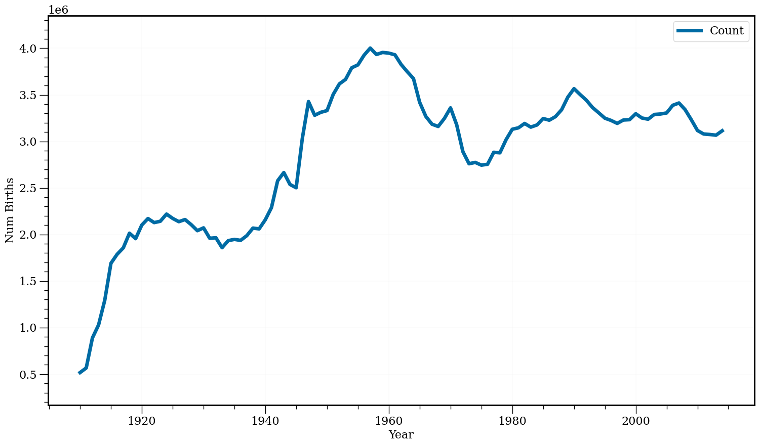
Babies
#In:
df = pd.read_csv('baby.csv')
df.head()
| Id | Name | Year | Gender | State | Count | |
|---|---|---|---|---|---|---|
| 0 | 1 | Mary | 1910 | F | AK | 14 |
| 1 | 2 | Annie | 1910 | F | AK | 12 |
| 2 | 3 | Anna | 1910 | F | AK | 10 |
| 3 | 4 | Margaret | 1910 | F | AK | 8 |
| 4 | 5 | Helen | 1910 | F | AK | 7 |
#In:
cols = ['Year', 'Count']
df[cols]
| Year | Count | |
|---|---|---|
| 0 | 1910 | 14 |
| 1 | 1910 | 12 |
| 2 | 1910 | 10 |
| 3 | 1910 | 8 |
| 4 | 1910 | 7 |
| ... | ... | ... |
| 5647421 | 2014 | 5 |
| 5647422 | 2014 | 5 |
| 5647423 | 2014 | 5 |
| 5647424 | 2014 | 5 |
| 5647425 | 2014 | 5 |
5647426 rows × 2 columns
#In:
(df[cols].groupby('Year').
 sum().
 tail())
| Count | |
|---|---|
| Year | |
| 2010 | 3116548 |
| 2011 | 3079145 |
| 2012 | 3073858 |
| 2013 | 3066443 |
| 2014 | 3113611 |
#In:
series = df[cols].groupby('Year').sum()
#In:
series.plot(figsize=(18, 10), fontsize=16, lw=5)
plt.xlabel('Year')
plt.ylabel('Num Births');
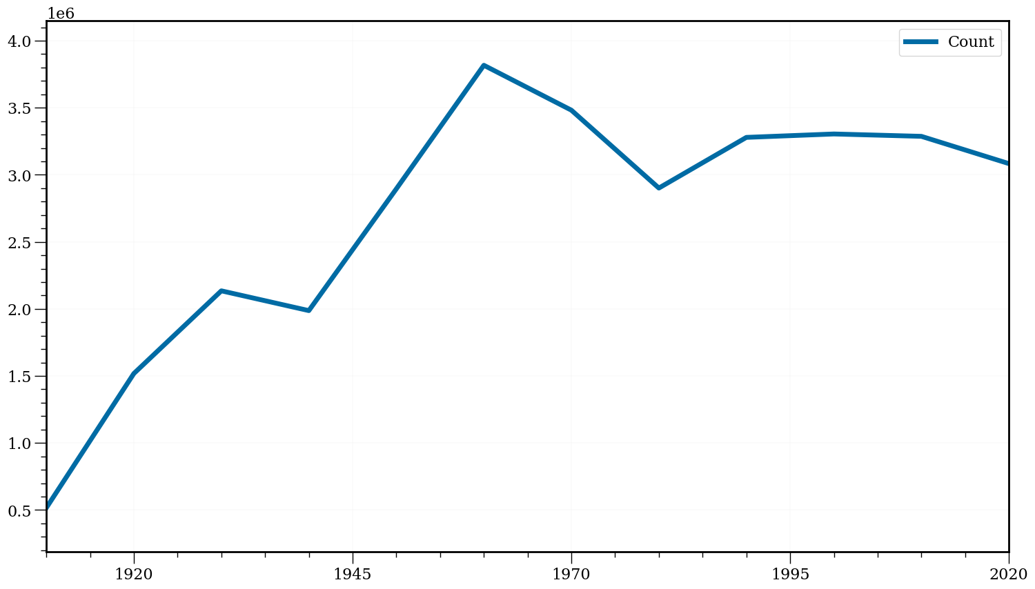
Pequena gambiarra abaixo, vou colocar cada ano no formato 1-1-ANO. Assim o pandas sabe criar uma data.
#In:
new_series = series.copy()
['1-1-{}'.format(str(x)) for x in new_series.index][0]
'1-1-1910'
Depois vou criar um novo índice
#In:
dates = pd.to_datetime(['15-6-{}'.format(str(x)) for x in new_series.index])
new_series.index = pd.DatetimeIndex(dates)
new_series.head()
/tmp/ipykernel_94185/1159144160.py:1: UserWarning: Parsing dates in DD/MM/YYYY format when dayfirst=False (the default) was specified. This may lead to inconsistently parsed dates! Specify a format to ensure consistent parsing.
  dates = pd.to_datetime(['15-6-{}'.format(str(x)) for x in new_series.index])
| Count | |
|---|---|
| 1910-06-15 | 516318 |
| 1911-06-15 | 565810 |
| 1912-06-15 | 887984 |
| 1913-06-15 | 1028553 |
| 1914-06-15 | 1293322 |
#In:
new_series.resample('10Y').sum()
| Count | |
|---|---|
| 1910-12-31 | 516318 |
| 1920-12-31 | 15177269 |
| 1930-12-31 | 21345615 |
| 1940-12-31 | 19870213 |
| 1950-12-31 | 28952157 |
| 1960-12-31 | 38165483 |
| 1970-12-31 | 34817092 |
| 1980-12-31 | 29009332 |
| 1990-12-31 | 32787986 |
| 2000-12-31 | 33042354 |
| 2010-12-31 | 32866450 |
| 2020-12-31 | 12333057 |
#In:
new_series.resample('10Y').mean().plot(figsize=(18, 10), fontsize=16, lw=5)
plt.xlabel('');
matplotlib
Existe uma grande variedade de ferramentas para visualizar dados.
Nós usaremos a biblioteca matplotlib, que é amplamente utilizada (embora mostre sua idade).
Se você estiver interessado em produzir visualizações interativas elaboradas para a Web, provavelmente não é a escolha certa, mas para gráficos de barras simples, gráficos de linhas e diagramas de dispersão, funciona muito bem.
Em particular, estamos usando o módulo matplotlib.pyplot.
Em seu uso mais simples, o pyplot mantém um estado interno no qual você constrói uma visualização passo a passo.
Quando terminar, você poderá salvá-lo (com savefig()) ou exibi-lo (com show()).
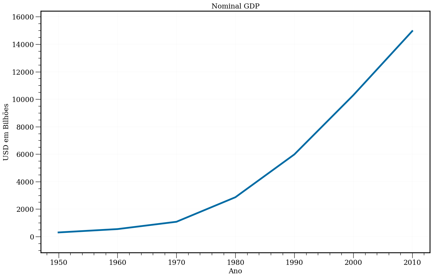
Vamos iniciar com duas listas simples de dados.
#In:
anos = [1950, 1960, 1970, 1980, 1990, 2000, 2010]
pib = [300.2, 543.3, 1075.9, 2862.5, 5979.6, 10289.7, 14958.3]
#In:
# cria um gráfico de linhas, com os anos no eixo x e o pib no eixo y
fig, ax = plt.subplots()

ax.plot(anos, pib)

# Adiciona um título
ax.set(
    title = 'Nominal GDP',
    xlabel = 'Ano',
    ylabel = 'USD em Bilhões'
);
Podemos também usar vetores numpy sem problemas
#In:
x = np.linspace(-100, 100, 100) * 0.1
x
array([-10.        ,  -9.7979798 ,  -9.5959596 ,  -9.39393939,
        -9.19191919,  -8.98989899,  -8.78787879,  -8.58585859,
        -8.38383838,  -8.18181818,  -7.97979798,  -7.77777778,
        -7.57575758,  -7.37373737,  -7.17171717,  -6.96969697,
        -6.76767677,  -6.56565657,  -6.36363636,  -6.16161616,
        -5.95959596,  -5.75757576,  -5.55555556,  -5.35353535,
        -5.15151515,  -4.94949495,  -4.74747475,  -4.54545455,
        -4.34343434,  -4.14141414,  -3.93939394,  -3.73737374,
        -3.53535354,  -3.33333333,  -3.13131313,  -2.92929293,
        -2.72727273,  -2.52525253,  -2.32323232,  -2.12121212,
        -1.91919192,  -1.71717172,  -1.51515152,  -1.31313131,
        -1.11111111,  -0.90909091,  -0.70707071,  -0.50505051,
        -0.3030303 ,  -0.1010101 ,   0.1010101 ,   0.3030303 ,
         0.50505051,   0.70707071,   0.90909091,   1.11111111,
         1.31313131,   1.51515152,   1.71717172,   1.91919192,
         2.12121212,   2.32323232,   2.52525253,   2.72727273,
         2.92929293,   3.13131313,   3.33333333,   3.53535354,
         3.73737374,   3.93939394,   4.14141414,   4.34343434,
         4.54545455,   4.74747475,   4.94949495,   5.15151515,
         5.35353535,   5.55555556,   5.75757576,   5.95959596,
         6.16161616,   6.36363636,   6.56565657,   6.76767677,
         6.96969697,   7.17171717,   7.37373737,   7.57575758,
         7.77777778,   7.97979798,   8.18181818,   8.38383838,
         8.58585859,   8.78787879,   8.98989899,   9.19191919,
         9.39393939,   9.5959596 ,   9.7979798 ,  10.        ])
#In:
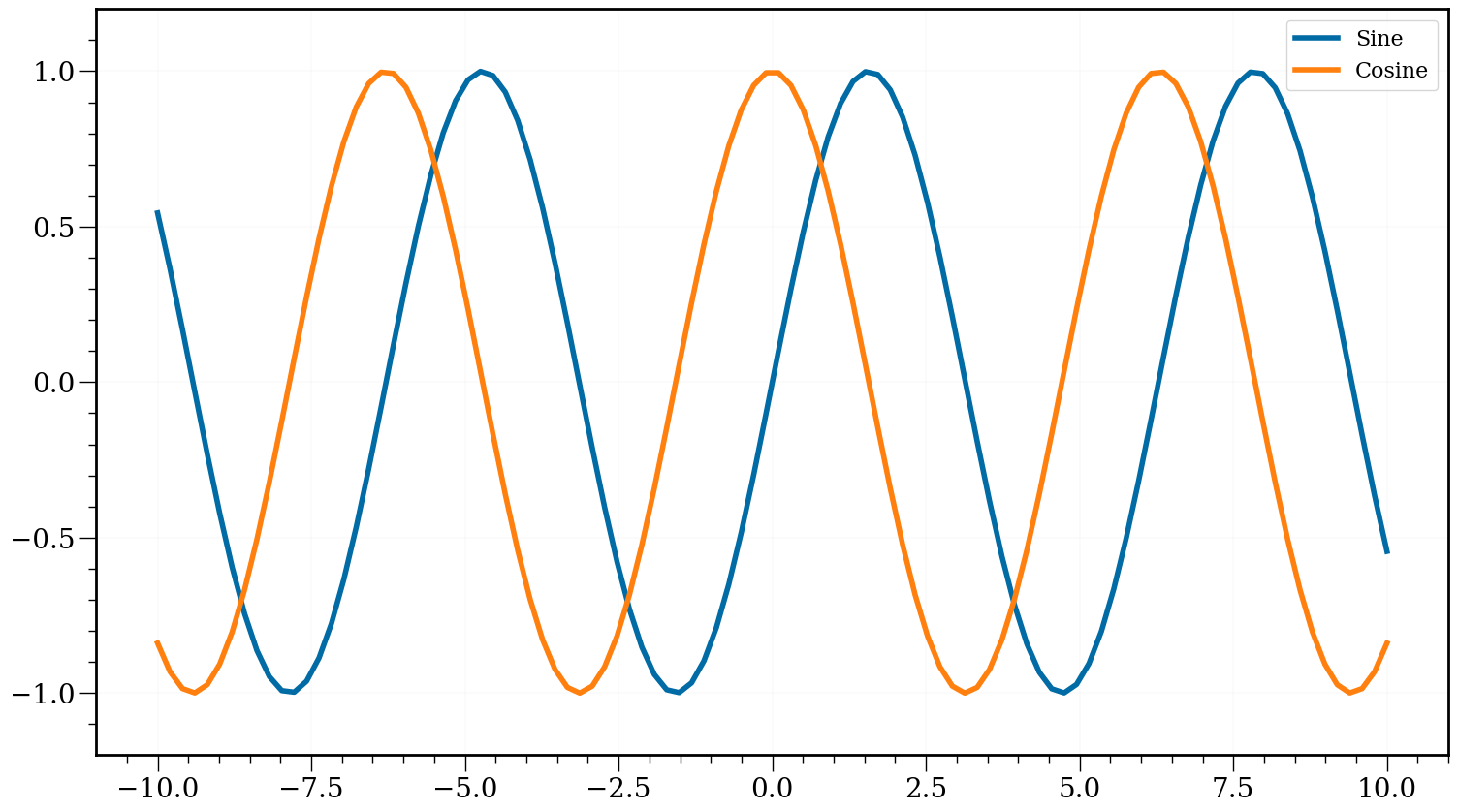
plt.figure(figsize=(18, 10))
plt.plot(x, np.sin(x), label='Sine')
plt.plot(x, np.cos(x), label='Cosine')
plt.legend()
ax = plt.gca()
for item in ([ax.title, ax.xaxis.label, ax.yaxis.label] +
ax.get_xticklabels() + ax.get_yticklabels()):
item.set_fontsize(20)
plt.show()
#In:
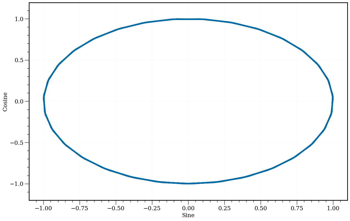
plt.plot(np.sin(x), np.cos(x))
plt.xlabel('Sine')
plt.ylabel('Cosine')
Text(0, 0.5, 'Cosine')
Movies Dataset
Vamos olhar para mais ou menos 50 atores e algumas métricas dos filmes que os mesmos fazem parte. Em particular, vamos iniciar explorando uma forma de visualizar dados que é o histograma.
#In:
df = pd.read_csv('https://media.githubusercontent.com/media/icd-ufmg/material/master/aulas/04-EDA-e-Vis/top_movies.csv')
#In:
df.head(6)
| Title | Studio | Gross | Gross (Adjusted) | Year | |
|---|---|---|---|---|---|
| 0 | Star Wars: The Force Awakens | Buena Vista (Disney) | 906723418 | 906723400 | 2015 |
| 1 | Avatar | Fox | 760507625 | 846120800 | 2009 |
| 2 | Titanic | Paramount | 658672302 | 1178627900 | 1997 |
| 3 | Jurassic World | Universal | 652270625 | 687728000 | 2015 |
| 4 | Marvel's The Avengers | Buena Vista (Disney) | 623357910 | 668866600 | 2012 |
| 5 | The Dark Knight | Warner Bros. | 534858444 | 647761600 | 2008 |
#In:
mean_g = df.groupby('Studio').mean()['Gross (Adjusted)']
/tmp/ipykernel_94185/4007597827.py:1: FutureWarning: The default value of numeric_only in DataFrameGroupBy.mean is deprecated. In a future version, numeric_only will default to False. Either specify numeric_only or select only columns which should be valid for the function.
  mean_g = df.groupby('Studio').mean()['Gross (Adjusted)']
#In:
mean_g.sort_values()[::-1].plot.bar(edgecolor='k');
#In:
plt.figure(figsize=(18, 10))
mean_g = df.groupby('Studio').mean()['Gross (Adjusted)']
mean_g /= 1e8
ax = mean_g.sort_values()[::-1].plot.bar(fontsize=20, edgecolor='r')
plt.ylabel('Média de Lucro em Milhões')
for item in ([ax.title, ax.xaxis.label, ax.yaxis.label] +
             ax.get_xticklabels() + ax.get_yticklabels()):
    item.set_fontsize(20)
/tmp/ipykernel_94185/25471854.py:2: FutureWarning: The default value of numeric_only in DataFrameGroupBy.mean is deprecated. In a future version, numeric_only will default to False. Either specify numeric_only or select only columns which should be valid for the function.
  mean_g = df.groupby('Studio').mean()['Gross (Adjusted)']
#In:
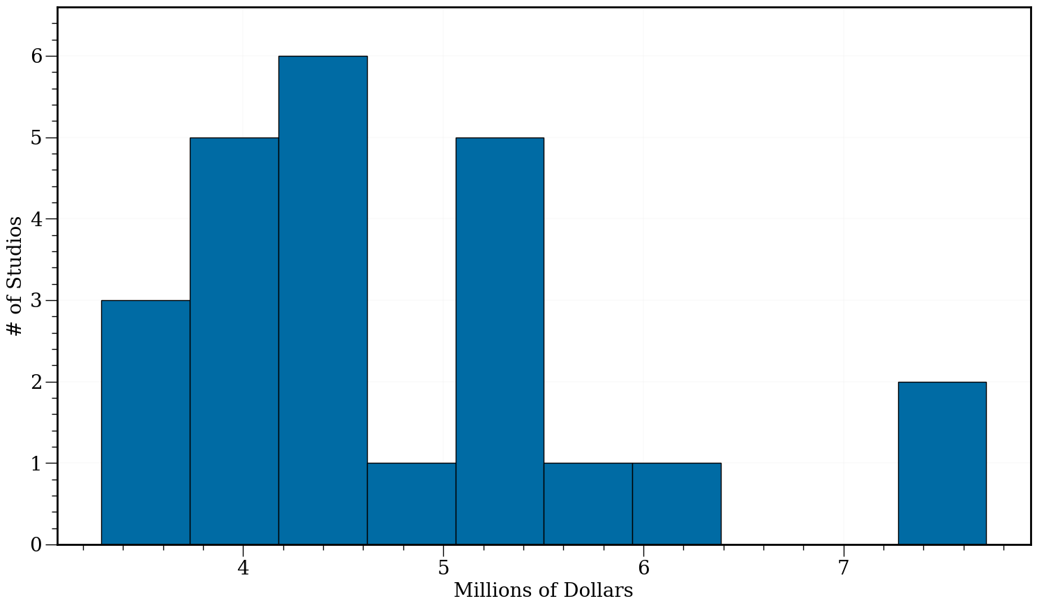
mean_g = df.groupby('Studio').mean()['Gross (Adjusted)']
mean_g /= 1e8
plt.figure(figsize=(18, 10))
plt.hist(mean_g, edgecolor='k')
plt.xlabel('Millions of Dollars')
plt.ylabel('# of Studios')
ax = plt.gca()
for item in ([ax.title, ax.xaxis.label, ax.yaxis.label] +
ax.get_xticklabels() + ax.get_yticklabels()):
item.set_fontsize(20)
/tmp/ipykernel_94185/2013192506.py:1: FutureWarning: The default value of numeric_only in DataFrameGroupBy.mean is deprecated. In a future version, numeric_only will default to False. Either specify numeric_only or select only columns which should be valid for the function.
  mean_g = df.groupby('Studio').mean()['Gross (Adjusted)']
Base de actors
#In:
df = pd.read_csv('https://media.githubusercontent.com/media/icd-ufmg/material/master/aulas/04-EDA-e-Vis/actors.csv')
df
| Actor | Total Gross | Number of Movies | Average per Movie | #1 Movie | Gross | |
|---|---|---|---|---|---|---|
| 0 | Harrison Ford | 4871.7 | 41 | 118.8 | Star Wars: The Force Awakens | 936.7 |
| 1 | Samuel L. Jackson | 4772.8 | 69 | 69.2 | The Avengers | 623.4 |
| 2 | Morgan Freeman | 4468.3 | 61 | 73.3 | The Dark Knight | 534.9 |
| 3 | Tom Hanks | 4340.8 | 44 | 98.7 | Toy Story 3 | 415.0 |
| 4 | Robert Downey, Jr. | 3947.3 | 53 | 74.5 | The Avengers | 623.4 |
| 5 | Eddie Murphy | 3810.4 | 38 | 100.3 | Shrek 2 | 441.2 |
| 6 | Tom Cruise | 3587.2 | 36 | 99.6 | War of the Worlds | 234.3 |
| 7 | Johnny Depp | 3368.6 | 45 | 74.9 | Dead Man's Chest | 423.3 |
| 8 | Michael Caine | 3351.5 | 58 | 57.8 | The Dark Knight | 534.9 |
| 9 | Scarlett Johansson | 3341.2 | 37 | 90.3 | The Avengers | 623.4 |
| 10 | Gary Oldman | 3294.0 | 38 | 86.7 | The Dark Knight | 534.9 |
| 11 | Robin Williams | 3279.3 | 49 | 66.9 | Night at the Museum | 250.9 |
| 12 | Bruce Willis | 3189.4 | 60 | 53.2 | Sixth Sense | 293.5 |
| 13 | Stellan Skarsgard | 3175.0 | 43 | 73.8 | The Avengers | 623.4 |
| 14 | Anthony Daniels | 3162.9 | 7 | 451.8 | Star Wars: The Force Awakens | 936.7 |
| 15 | Ian McKellen | 3150.4 | 31 | 101.6 | Return of the King | 377.8 |
| 16 | Will Smith | 3149.1 | 24 | 131.2 | Independence Day | 306.2 |
| 17 | Stanley Tucci | 3123.9 | 50 | 62.5 | Catching Fire | 424.7 |
| 18 | Matt Damon | 3107.3 | 39 | 79.7 | The Martian | 228.4 |
| 19 | Robert DeNiro | 3081.3 | 79 | 39.0 | Meet the Fockers | 279.3 |
| 20 | Cameron Diaz | 3031.7 | 34 | 89.2 | Shrek 2 | 441.2 |
| 21 | Liam Neeson | 2942.7 | 63 | 46.7 | The Phantom Menace | 474.5 |
| 22 | Andy Serkis | 2890.6 | 23 | 125.7 | Star Wars: The Force Awakens | 936.7 |
| 23 | Don Cheadle | 2885.4 | 34 | 84.9 | Avengers: Age of Ultron | 459.0 |
| 24 | Ben Stiller | 2827.0 | 37 | 76.4 | Meet the Fockers | 279.3 |
| 25 | Helena Bonham Carter | 2822.0 | 36 | 78.4 | Harry Potter / Deathly Hallows (P2) | 381.0 |
| 26 | Orlando Bloom | 2815.8 | 17 | 165.6 | Dead Man's Chest | 423.3 |
| 27 | Woody Harrelson | 2815.8 | 50 | 56.3 | Catching Fire | 424.7 |
| 28 | Cate Blanchett | 2802.6 | 39 | 71.9 | Return of the King | 377.8 |
| 29 | Julia Roberts | 2735.3 | 42 | 65.1 | Ocean's Eleven | 183.4 |
| 30 | Elizabeth Banks | 2726.3 | 35 | 77.9 | Catching Fire | 424.7 |
| 31 | Ralph Fiennes | 2715.3 | 36 | 75.4 | Harry Potter / Deathly Hallows (P2) | 381.0 |
| 32 | Emma Watson | 2681.9 | 17 | 157.8 | Harry Potter / Deathly Hallows (P2) | 381.0 |
| 33 | Tommy Lee Jones | 2681.3 | 46 | 58.3 | Men in Black | 250.7 |
| 34 | Brad Pitt | 2680.9 | 40 | 67.0 | World War Z | 202.4 |
| 35 | Adam Sandler | 2661.0 | 32 | 83.2 | Hotel Transylvania 2 | 169.7 |
| 36 | Daniel Radcliffe | 2634.4 | 17 | 155.0 | Harry Potter / Deathly Hallows (P2) | 381.0 |
| 37 | Jonah Hill | 2605.1 | 29 | 89.8 | The LEGO Movie | 257.8 |
| 38 | Owen Wilson | 2602.3 | 39 | 66.7 | Night at the Museum | 250.9 |
| 39 | Idris Elba | 2580.6 | 26 | 99.3 | Avengers: Age of Ultron | 459.0 |
| 40 | Bradley Cooper | 2557.7 | 25 | 102.3 | American Sniper | 350.1 |
| 41 | Mark Wahlberg | 2549.8 | 36 | 70.8 | Transformers 4 | 245.4 |
| 42 | Jim Carrey | 2545.2 | 27 | 94.3 | The Grinch | 260.0 |
| 43 | Dustin Hoffman | 2522.1 | 43 | 58.7 | Meet the Fockers | 279.3 |
| 44 | Leonardo DiCaprio | 2518.3 | 25 | 100.7 | Titanic | 658.7 |
| 45 | Jeremy Renner | 2500.3 | 21 | 119.1 | The Avengers | 623.4 |
| 46 | Philip Seymour Hoffman | 2463.7 | 40 | 61.6 | Catching Fire | 424.7 |
| 47 | Sandra Bullock | 2462.6 | 35 | 70.4 | Minions | 336.0 |
| 48 | Chris Evans | 2457.8 | 23 | 106.9 | The Avengers | 623.4 |
| 49 | Anne Hathaway | 2416.5 | 25 | 96.7 | The Dark Knight Rises | 448.1 |
#In:
plt.figure(figsize=(18, 10))
plt.hist(df['Average per Movie'], edgecolor='k')
plt.xlabel('Média por Filme')
plt.ylabel('Número de linhas')
ax = plt.gca()
for item in ([ax.title, ax.xaxis.label, ax.yaxis.label] +
             ax.get_xticklabels() + ax.get_yticklabels()):
    item.set_fontsize(20)
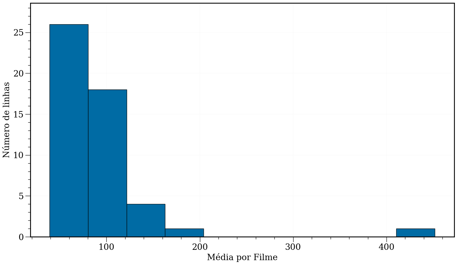
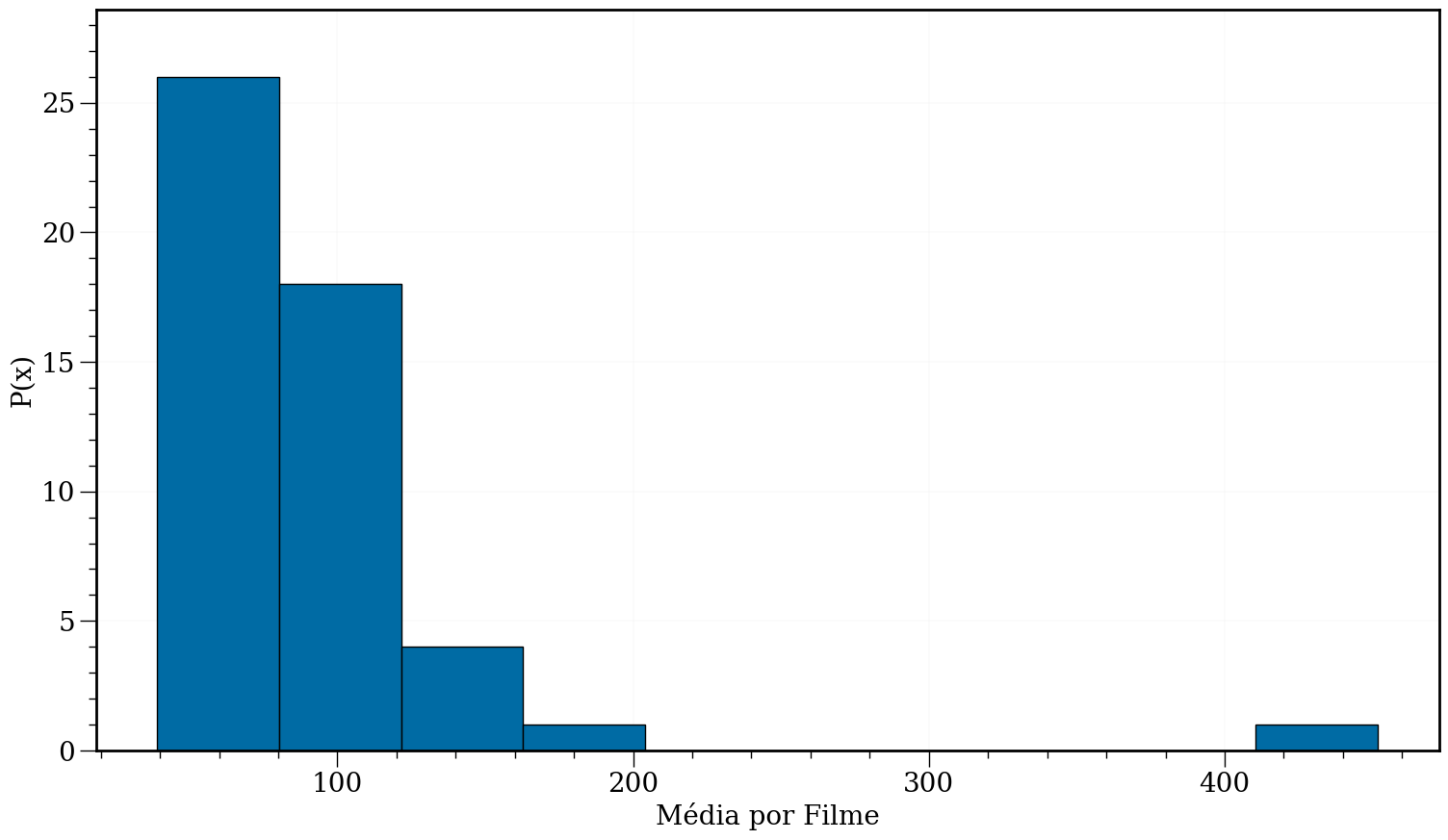
Obtendo a densidade de pontos em cada barra. Note que isto nem sempre vai traduzir para um valor entre [0, 1]. Depende do eixo-x.
#In:
plt.figure(figsize=(18, 10))
plt.hist(df['Average per Movie'], edgecolor='k')
plt.xlabel('Média por Filme')
plt.ylabel('P(x)')
ax = plt.gca()
for item in ([ax.title, ax.xaxis.label, ax.yaxis.label] +
             ax.get_xticklabels() + ax.get_yticklabels()):
    item.set_fontsize(20)
#In:
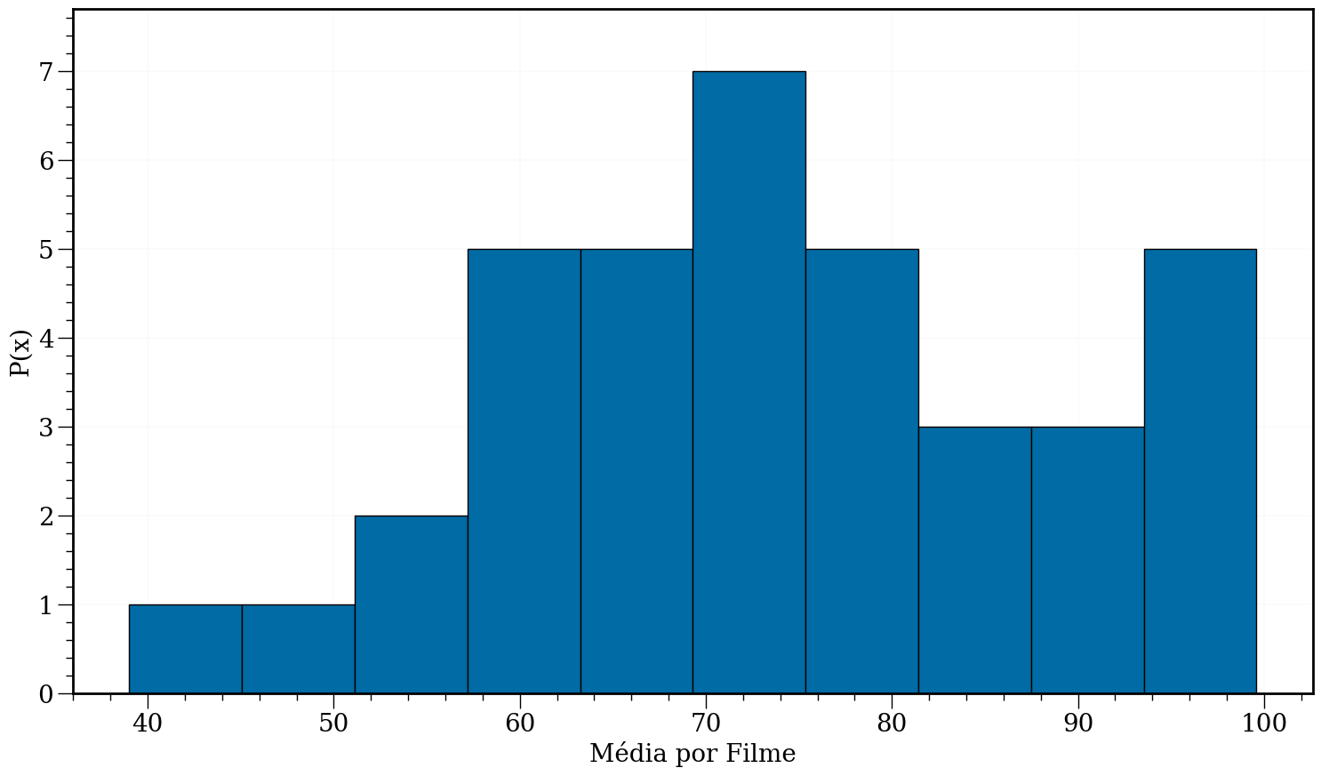
plt.figure(figsize=(18, 10))
data = df['Average per Movie'][df['Average per Movie'] < 100]
plt.xlabel('Média por Filme')
plt.ylabel('P(x)')
plt.hist(data, edgecolor='k')
ax = plt.gca()
for item in ([ax.title, ax.xaxis.label, ax.yaxis.label] +
ax.get_xticklabels() + ax.get_yticklabels()):
item.set_fontsize(20)
#In:
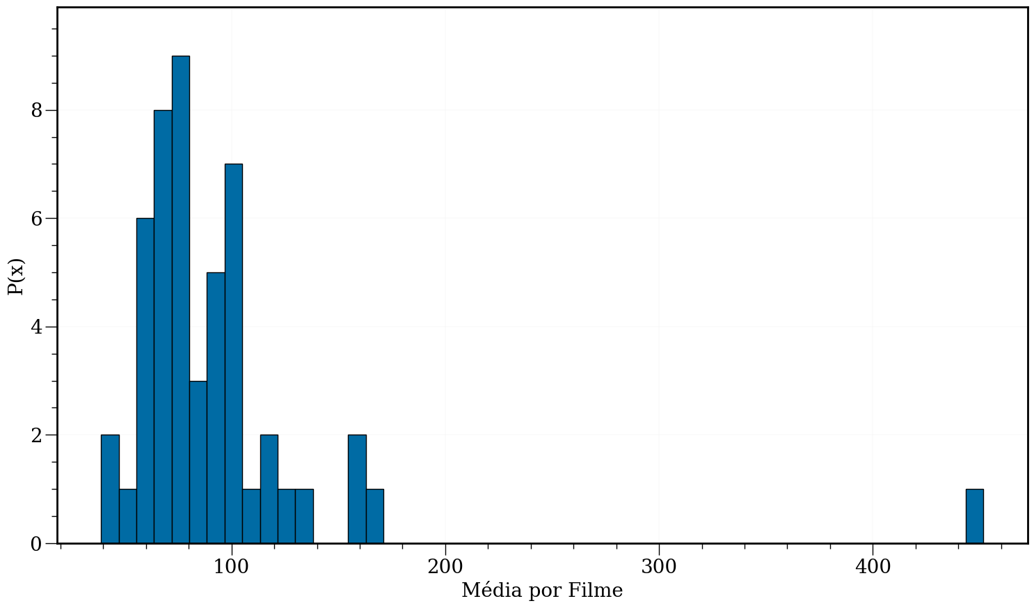
plt.figure(figsize=(18, 10))
data = df['Average per Movie']
plt.xlabel('Média por Filme')
plt.ylabel('P(x)')
plt.hist(data, bins=50, edgecolor='k')
ax = plt.gca()
for item in ([ax.title, ax.xaxis.label, ax.yaxis.label] +
ax.get_xticklabels() + ax.get_yticklabels()):
item.set_fontsize(20)
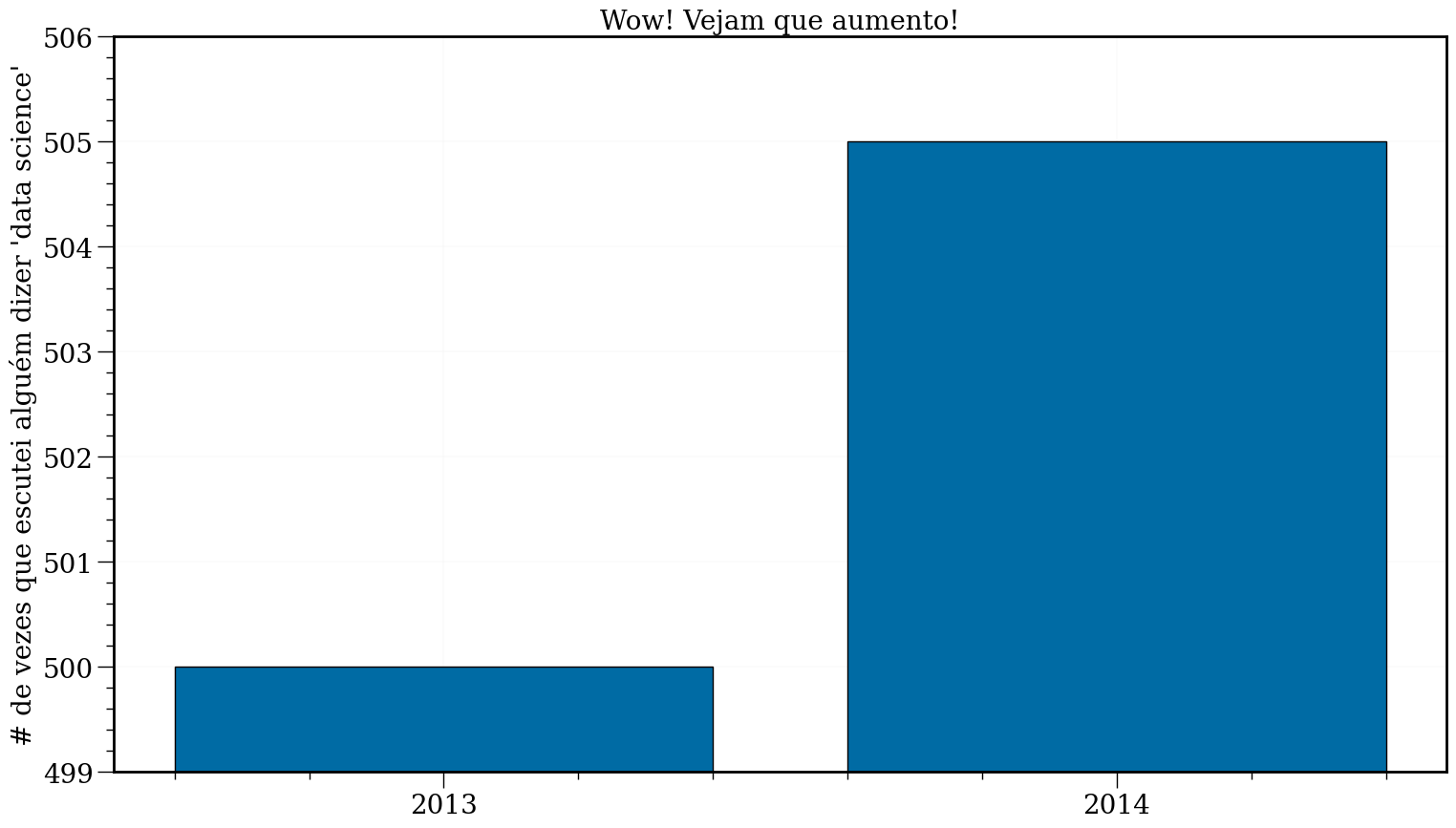
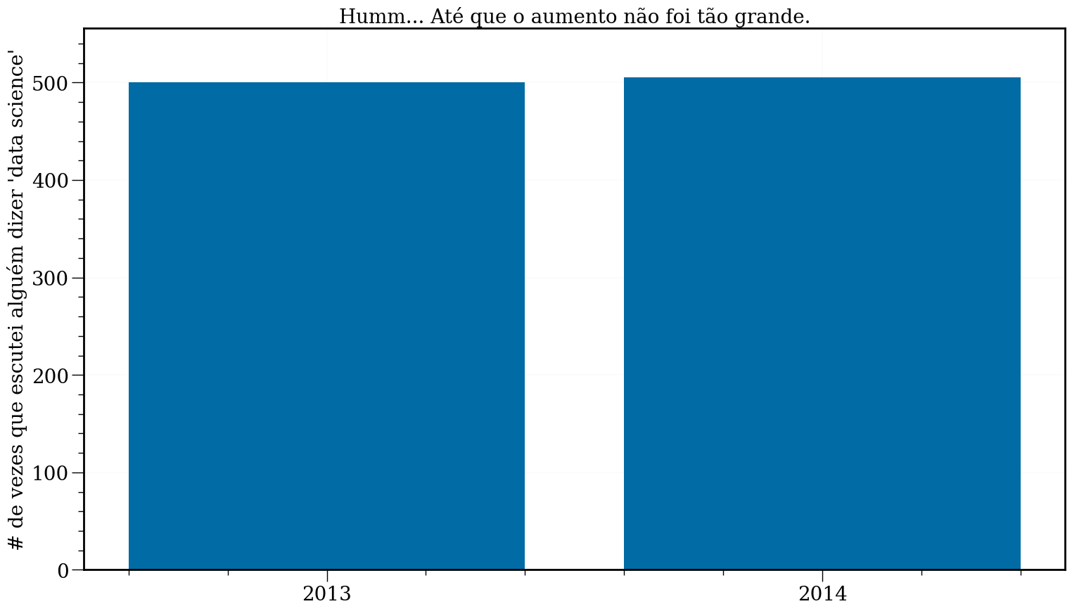
Problemas de escala
#In:
plt.figure(figsize=(18, 10))
mentions = [500, 505]
years = [2013, 2014]

plt.bar(years, mentions, edgecolor='k')

plt.xticks(years)
plt.ylabel("# de vezes que escutei alguém dizer 'data science'")

# define o os limites do eixo y:
plt.ylim(499,506)

plt.title("Wow! Vejam que aumento!")

ax = plt.gca()
for item in ([ax.title, ax.xaxis.label, ax.yaxis.label] +
             ax.get_xticklabels() + ax.get_yticklabels()):
    item.set_fontsize(20)
#In:
plt.figure(figsize=(18, 10))

plt.bar(years, mentions)

plt.xticks(years)
plt.ylabel("# de vezes que escutei alguém dizer 'data science'")

plt.ylim(0, max(mentions)*1.1)
plt.title("Humm... Até que o aumento não foi tão grande.")

ax = plt.gca()
for item in ([ax.title, ax.xaxis.label, ax.yaxis.label] +
             ax.get_xticklabels() + ax.get_yticklabels()):
    item.set_fontsize(20)
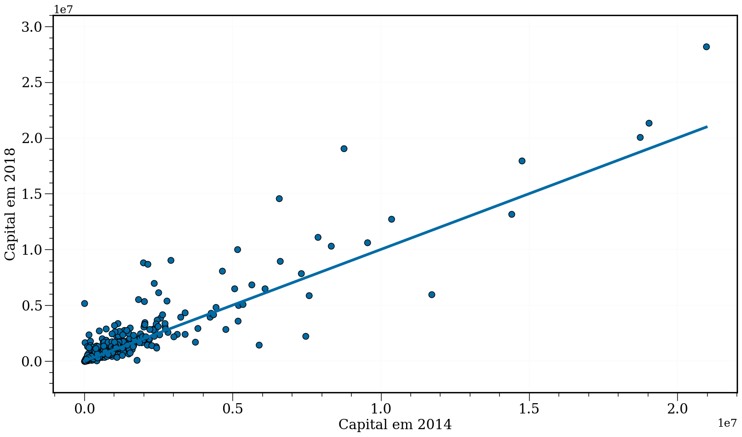
Dados 2d com e leitura de JSON
O pandas também sabe ler dados em json! Vamos tentar.
#In:
df = pd.read_json('capital.json')
#In:
df.head()
| estado | patrimonio_eleicao_1 | patrimonio_eleicao_2 | nome_urna | cpf | sigla_partido | cod_unidade_eleitoral_1 | cod_unidade_eleitoral_2 | unidade_eleitoral | cargo_pleiteado_1 | cargo_pleiteado_2 | ano_um | ano_dois | sequencial_candidato_1 | sequencial_candidato_2 | situacao_eleicao_1 | situacao_eleicao_2 | |
|---|---|---|---|---|---|---|---|---|---|---|---|---|---|---|---|---|---|
| 0 | MG | 2326963.85 | 2890296.74 | Stefano Aguiar | 1608657 | PSD | MG | MG | Minas Gerais | DEPUTADO FEDERAL | DEPUTADO FEDERAL | 2014 | 2018 | 130000001189 | 130000613225 | ELEITO | ELEITO |
| 1 | RJ | 4239563.82 | 3943907.61 | Altineu Cortes | 7487738 | PR | RJ | RJ | Rio De Janeiro | DEPUTADO FEDERAL | DEPUTADO FEDERAL | 2014 | 2018 | 190000001858 | 190000604181 | ELEITO | ELEITO |
| 2 | BA | 1077668.74 | 2281417.64 | Mário Negromonte Jr | 31226540 | PP | BA | BA | Bahia | DEPUTADO FEDERAL | DEPUTADO FEDERAL | 2014 | 2018 | 50000000167 | 50000605225 | ELEITO | ELEITO |
| 3 | CE | 14399524.97 | 13160762.14 | Roberto Pessoa | 113735391 | PSDB | CE | CE | Ceará | VICE-GOVERNADOR | DEPUTADO FEDERAL | 2014 | 2018 | 60000000604 | 60000611570 | NÃO ELEITO | ELEITO |
| 4 | SP | 713217.64 | 972916.79 | Vitor Lippi | 168780860 | PSDB | SP | SP | São Paulo | DEPUTADO FEDERAL | DEPUTADO FEDERAL | 2014 | 2018 | 250000001354 | 250000605413 | ELEITO | ELEITO |
#In:
plt.figure(figsize=(18, 10))
plt.scatter(df['patrimonio_eleicao_1'], df['patrimonio_eleicao_2'], s=80, edgecolor='k')
linha45 = np.unique(df['patrimonio_eleicao_1'])
plt.plot(linha45, linha45)

plt.xlabel('Capital em 2014')
plt.ylabel('Capital em 2018')
ax = plt.gca()
for item in ([ax.title, ax.xaxis.label, ax.yaxis.label] +
             ax.get_xticklabels() + ax.get_yticklabels()):
    item.set_fontsize(20)
plt.show()